
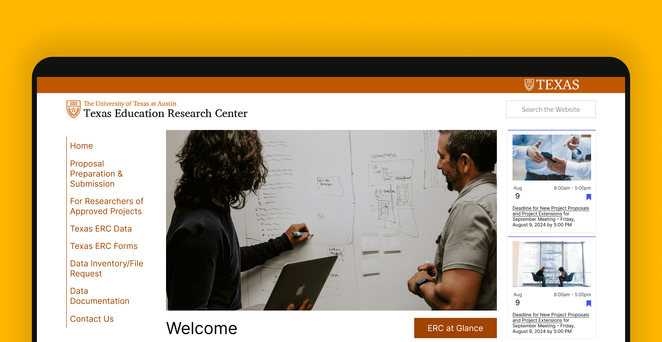
Overview
In this project, I focused on designing a more intuitive, accessible interface, moving through three core phases: Research, Design, and Development. This case study highlights the research and design journey, driven by user feedback and expert consultation.
Understand user pain points and gather actionable insights for designing an improved website experience.
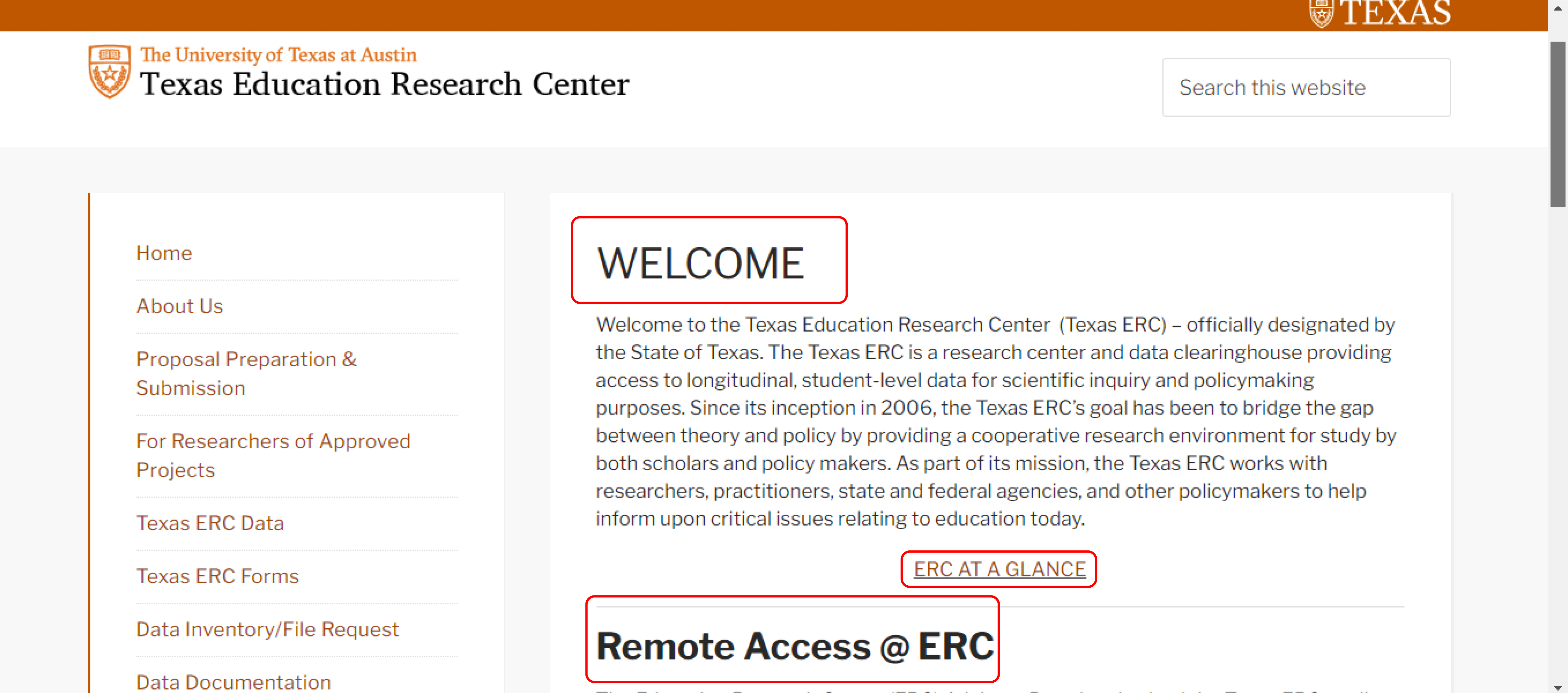
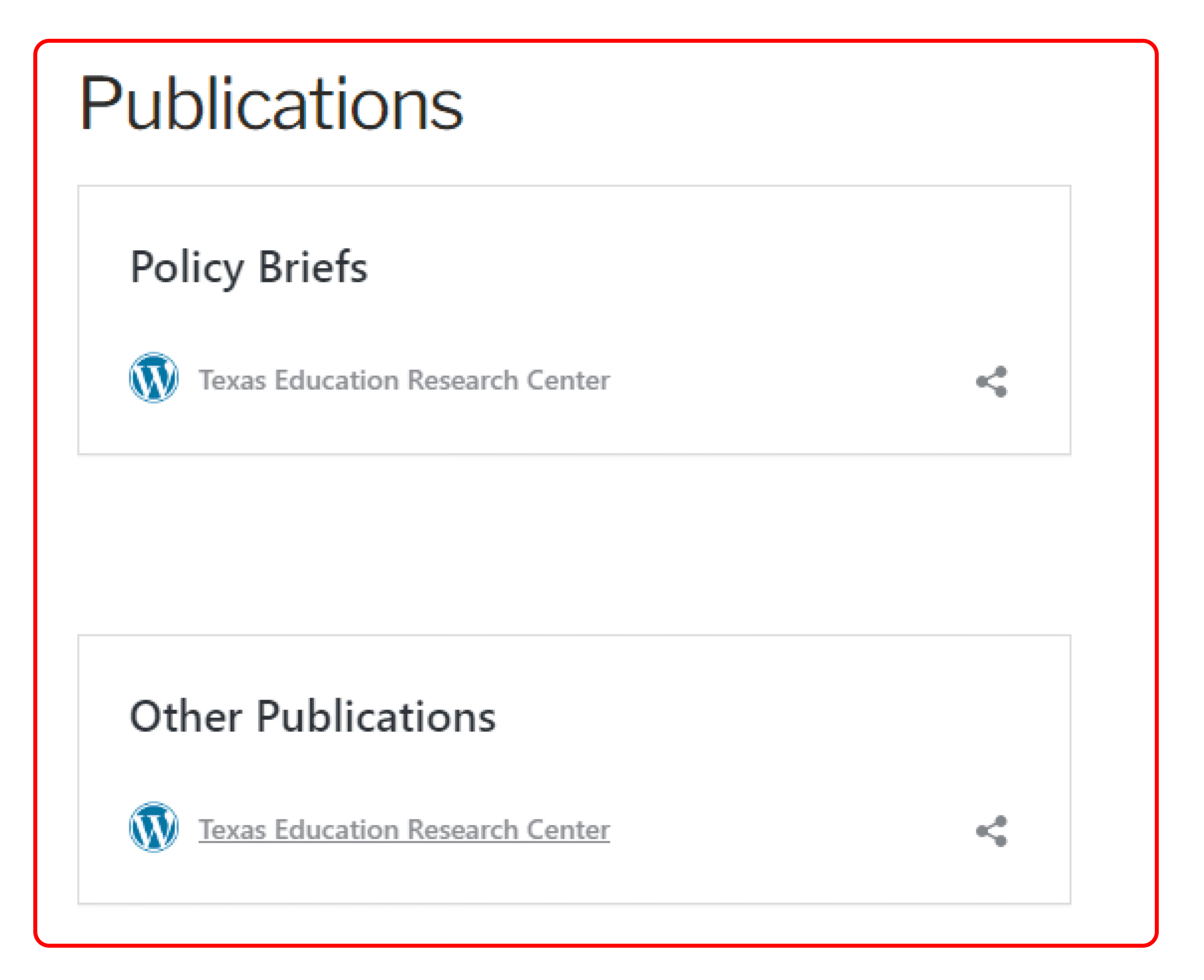
Initial Review
As the first user, I performed a usability review to experience the website's flow and pinpoint potential issues firsthand.


Survey
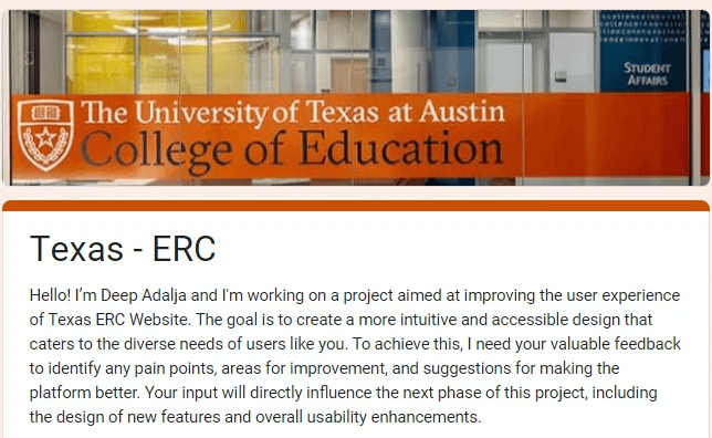
I created and distributed a survey form to gather feedback from actual users
The survey focused on usability, accessibility, and overall user experience.
Objectives
Insights Mapping
Link to FigJam Board
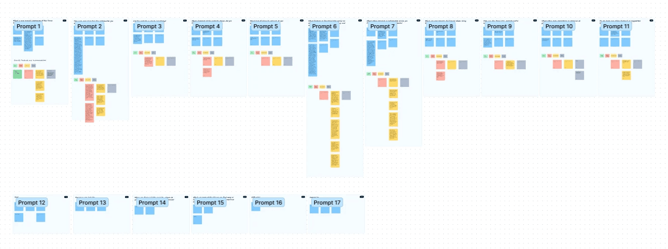
I used a FigJam board to categorize survey results into four key areas: Positive Feedback, Negative Feedback, Recommendations, and Resources Mentioned.
Categorizing Meta Data

Expert Consultation
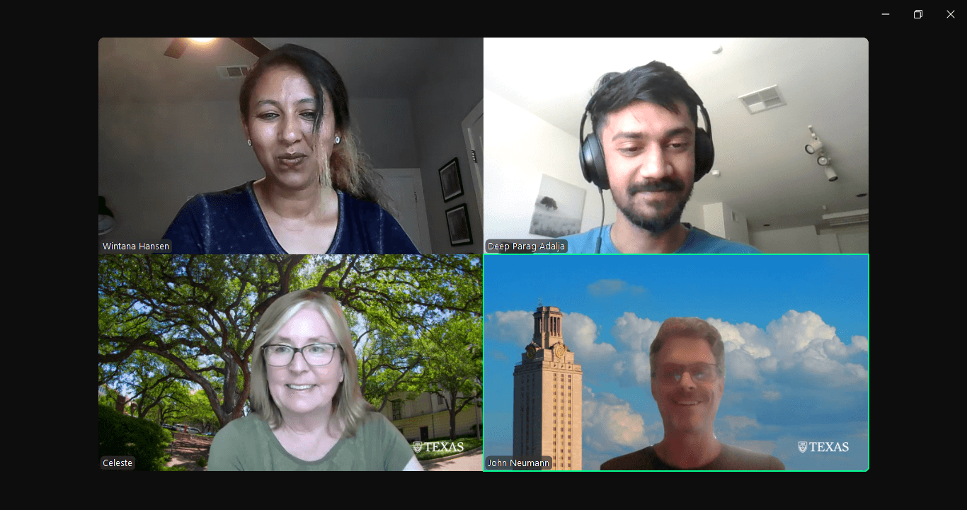
I consulted Dr. John Neumann, a well-known professor who teaches Accessible UX at UT Austin. He suggested conducting more user interviews to deepen the research.
User Interviews
Following the recommendation, I conducted additional user interviews, gathering more qualitative data.
I distilled these findings to refine the user personas and pain points.

Updated the Figjam Board following the interviews
User Research Insights
The Designs were usability-tested to ensure all elements aligned with user expectations.


Competitive Analysis
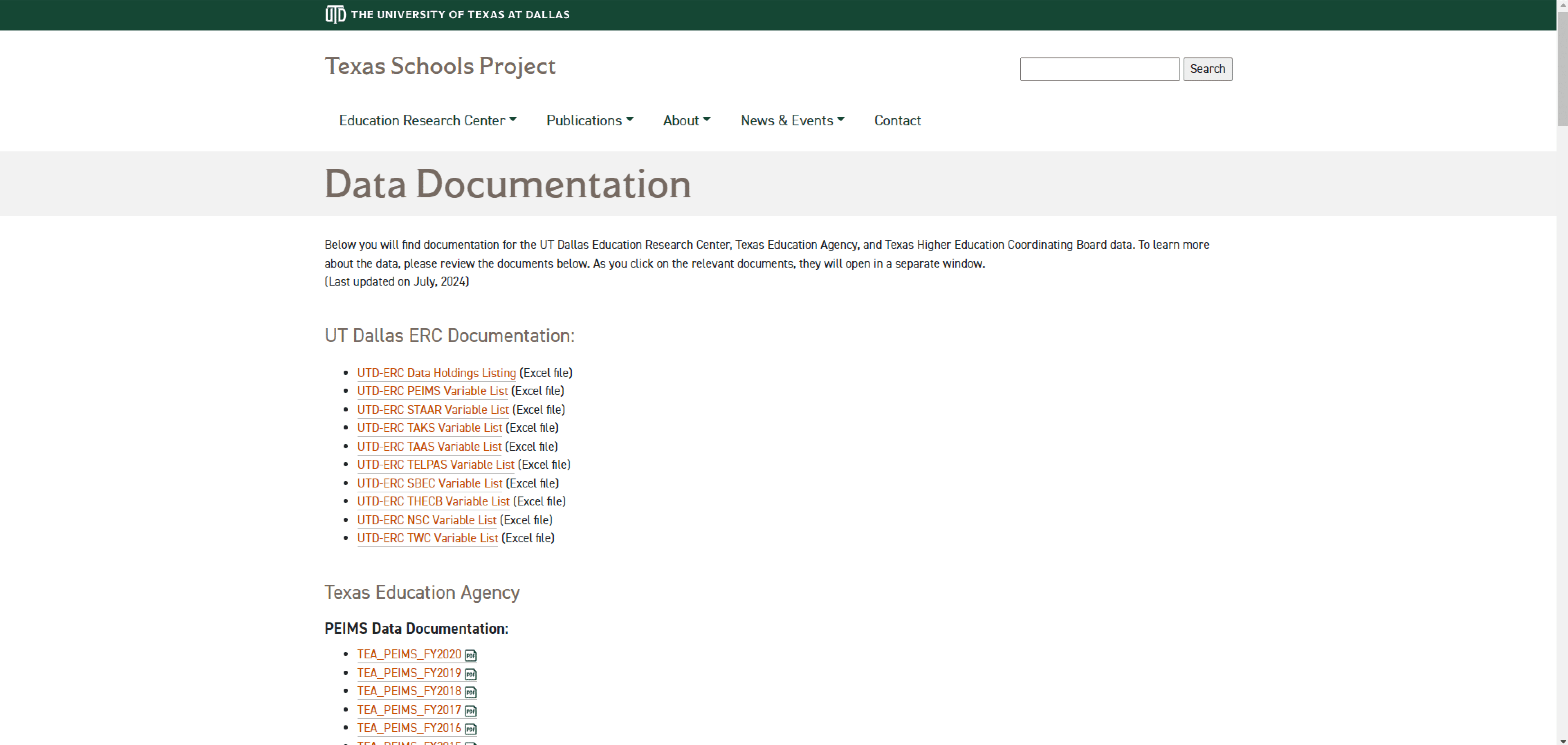
Based on the resources mentioned by users, I conducted a competitive analysis to benchmark Texas ERC website against similar platforms, focusing on usability, design trends, and accessibility.

I did SWOT analysis of the competitors and figured out all the areas of improvement.
Major Design Update
Transforming User Experience with a 3-Column Redesign
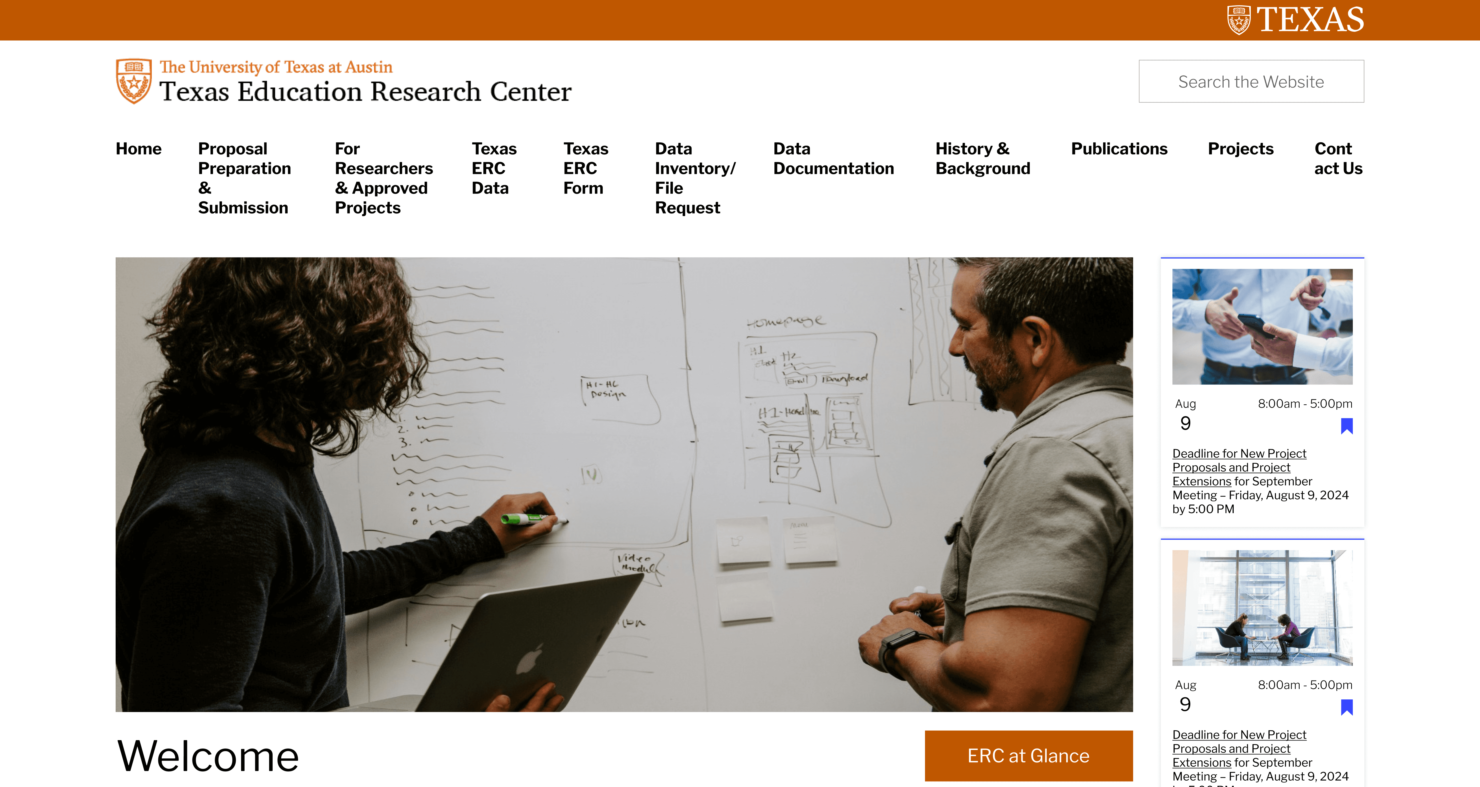
In response to user pain points, we transitioned from a traditional 2-column layout to a more dynamic 3-column design.
This change aims to enhance navigation, streamline content flow, and improve overall usability. By addressing core challenges, we created a more intuitive and efficient experience for users.
Projected Benefits
Improved Content Distribution: Easier navigation with clearly defined sections for key information.
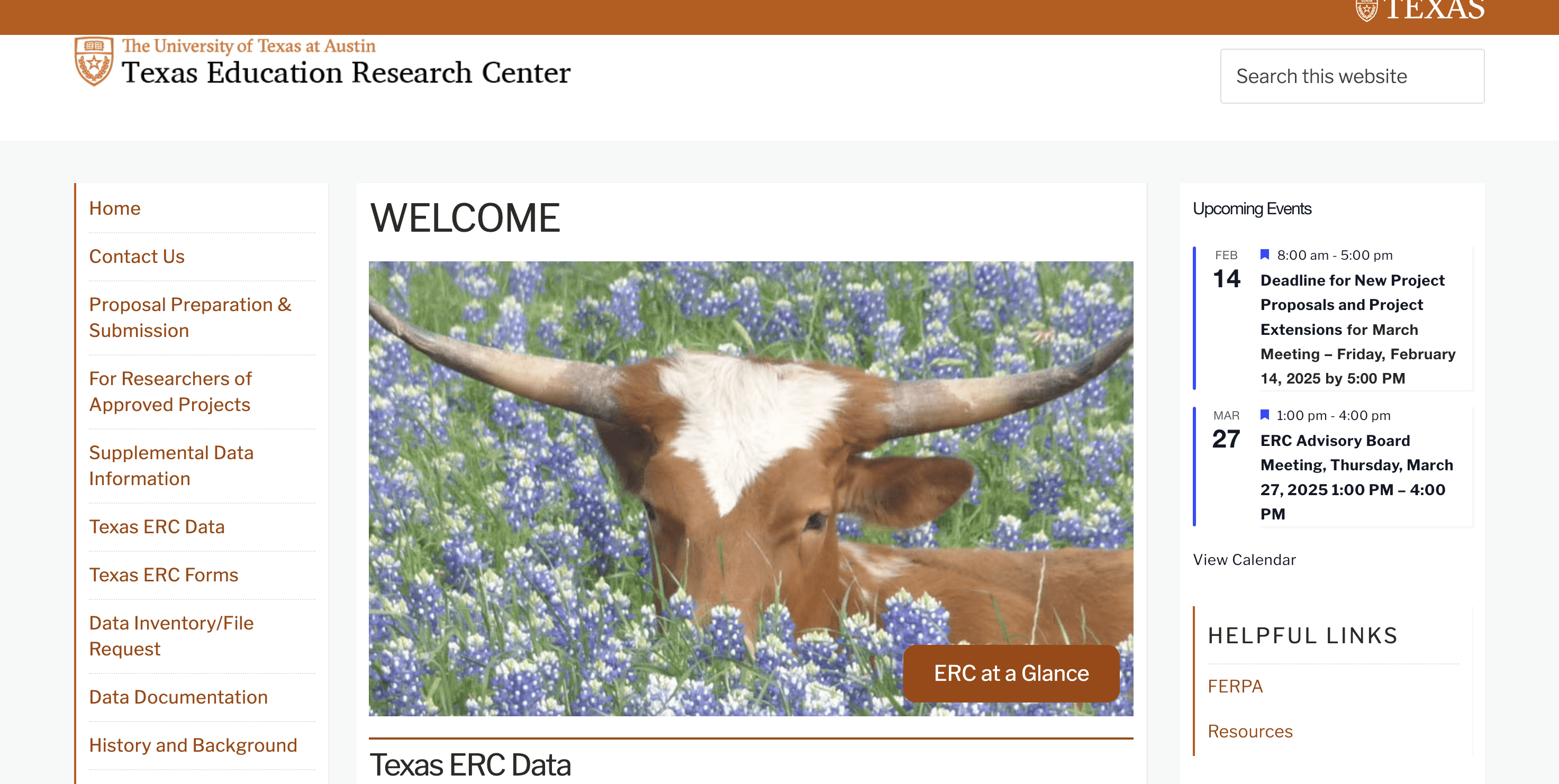
Enhanced Accessibility: More flexible layout adapts better to diverse screen sizes and user needs.
Reduced Cognitive Load: Users can find information faster without overwhelming the interface.
Increased Engagement: More visible content encourages longer interaction with the site.
Initial Paper Wireframes
I sketched out the initial wireframes based on the insights gained from user research.
Landing Page of Texas ERC

Low-Fidelity Designs
I then transitioned to low-fidelity (lo-fi) digital wireframes, focusing on the core layout and navigation structure without the distraction of detailed visuals.
Landing Page of Texas ERC

My Design Decisions
Optimized User Flow: Reduced Number of Clicks for Seamless Navigation


After
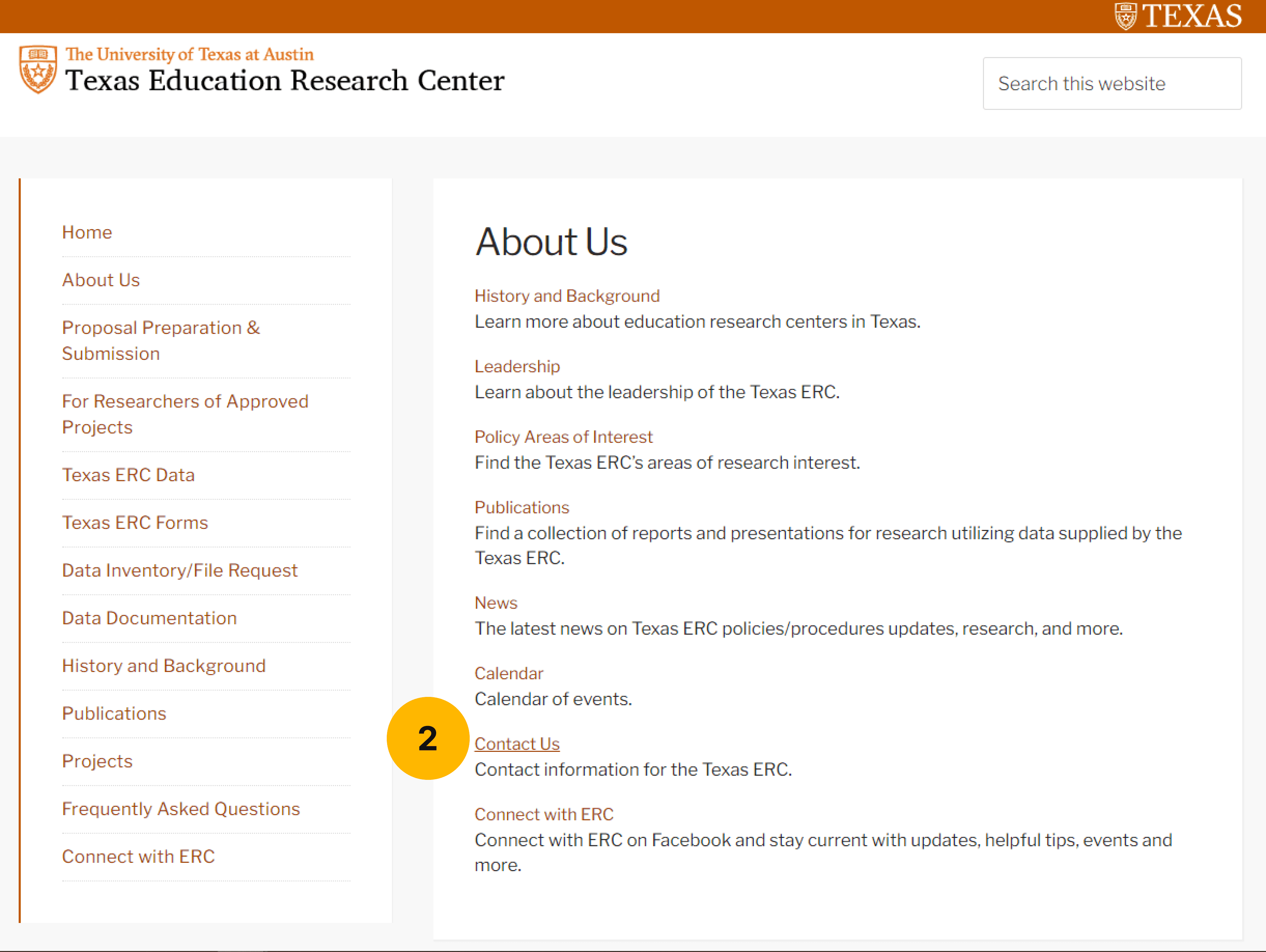
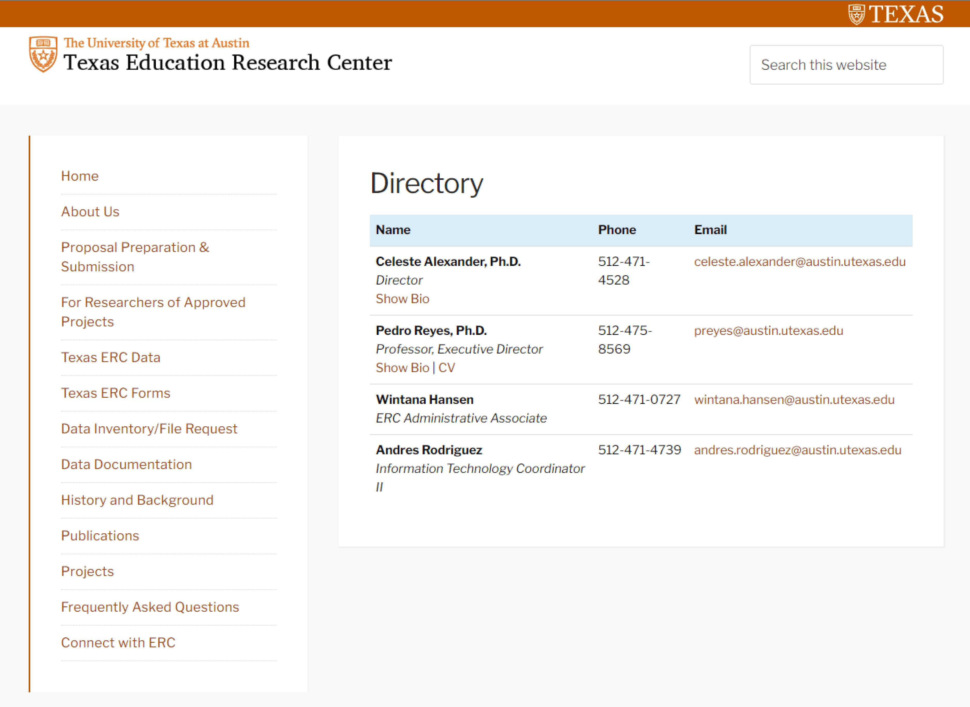
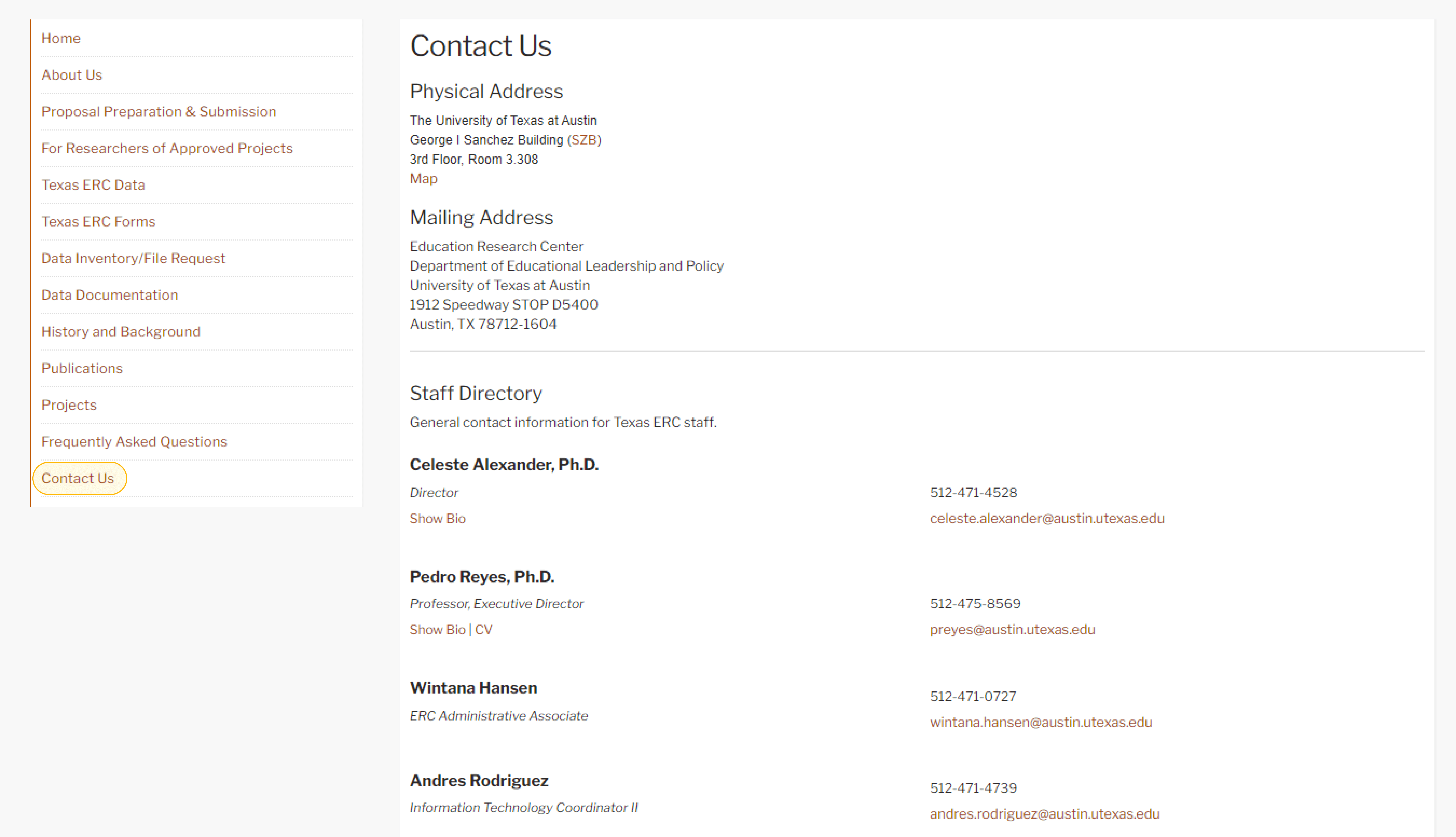
In the redesign, I streamlined navigation by reducing the steps to access the staff directory from four to just one. Now, users can quickly find the directory through a prominent shortcut on the homepage, significantly reducing clicks and enhancing the user experience.
The Two Navbars (A/B Testing)
B
The new 3-column layout retained the previously accessible navigation panel.

The 3rd Column
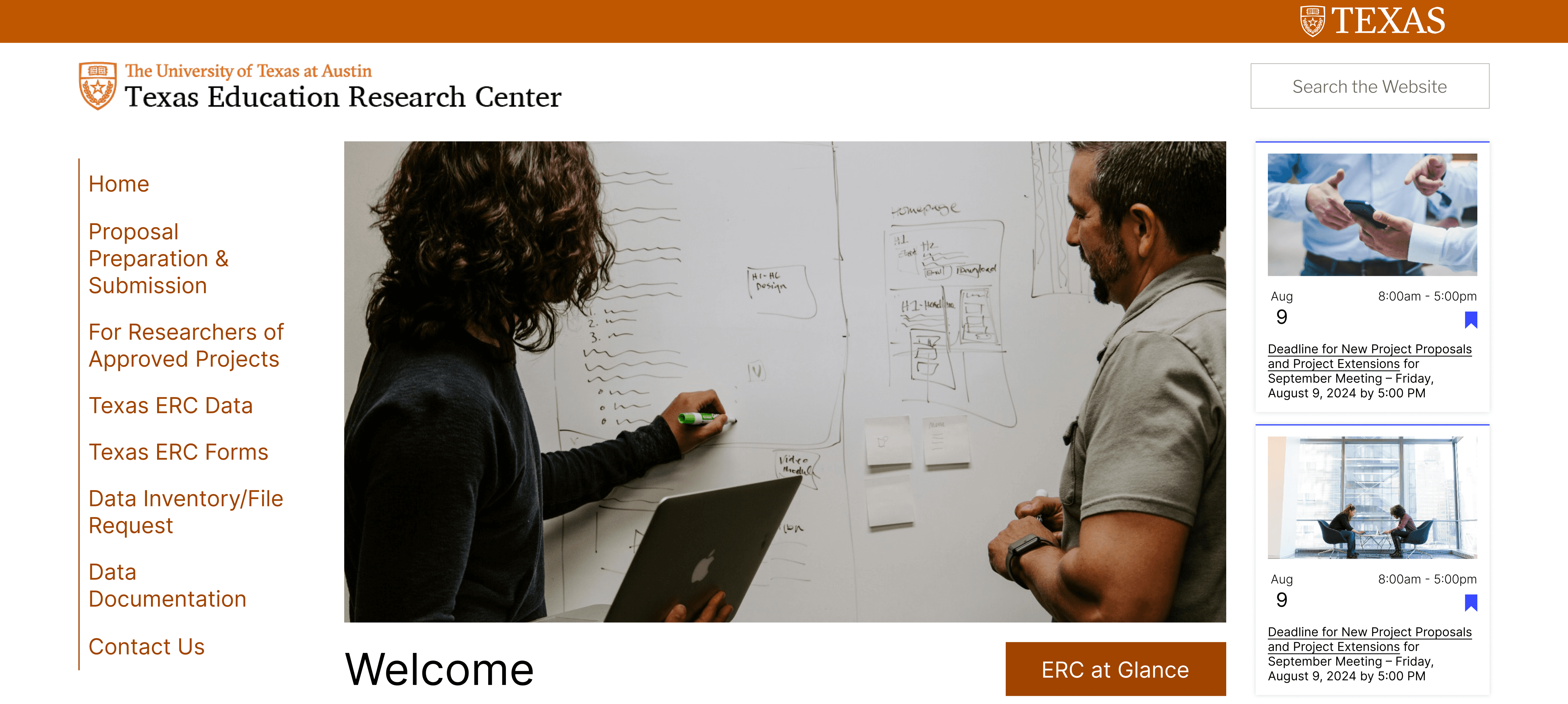
Before
Based on user feedback, the "Upcoming Events" tab, which is crucial, was positioned at the bottom.
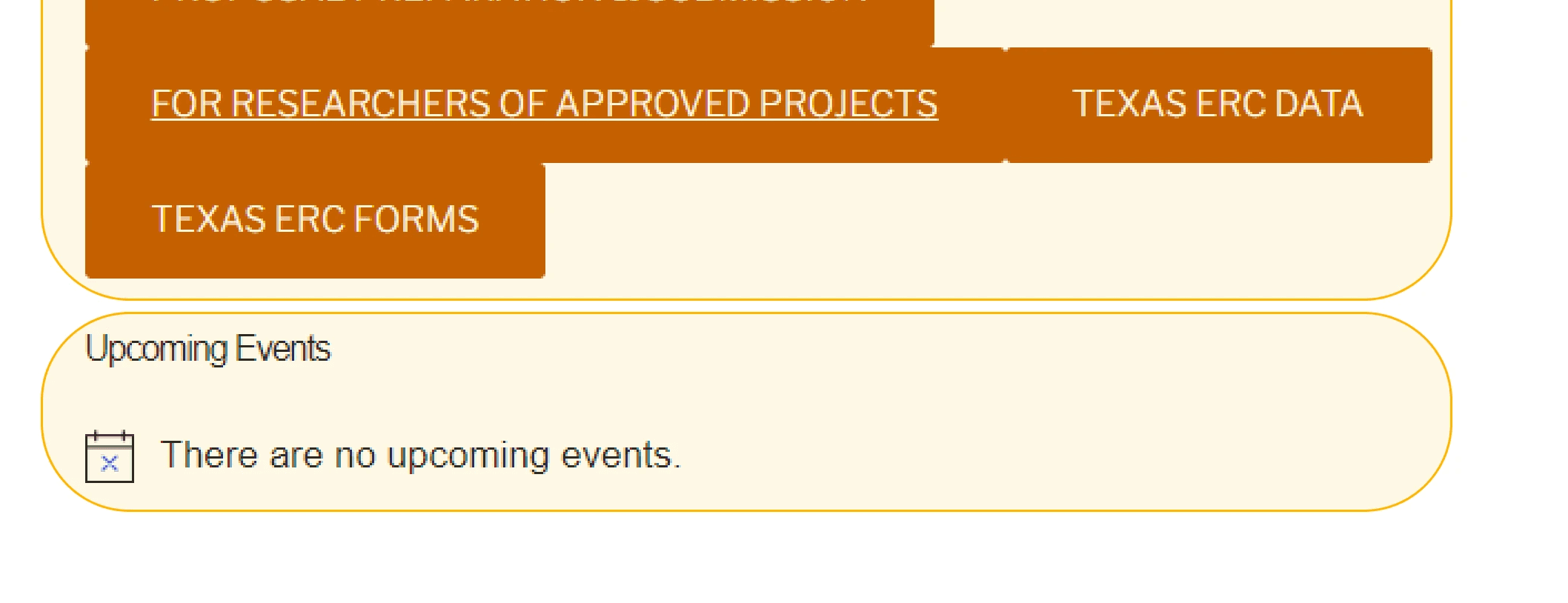


I was responsible for redeveloping the website, using WordPress and CSS3 throughout the process.
Major Development Challenge
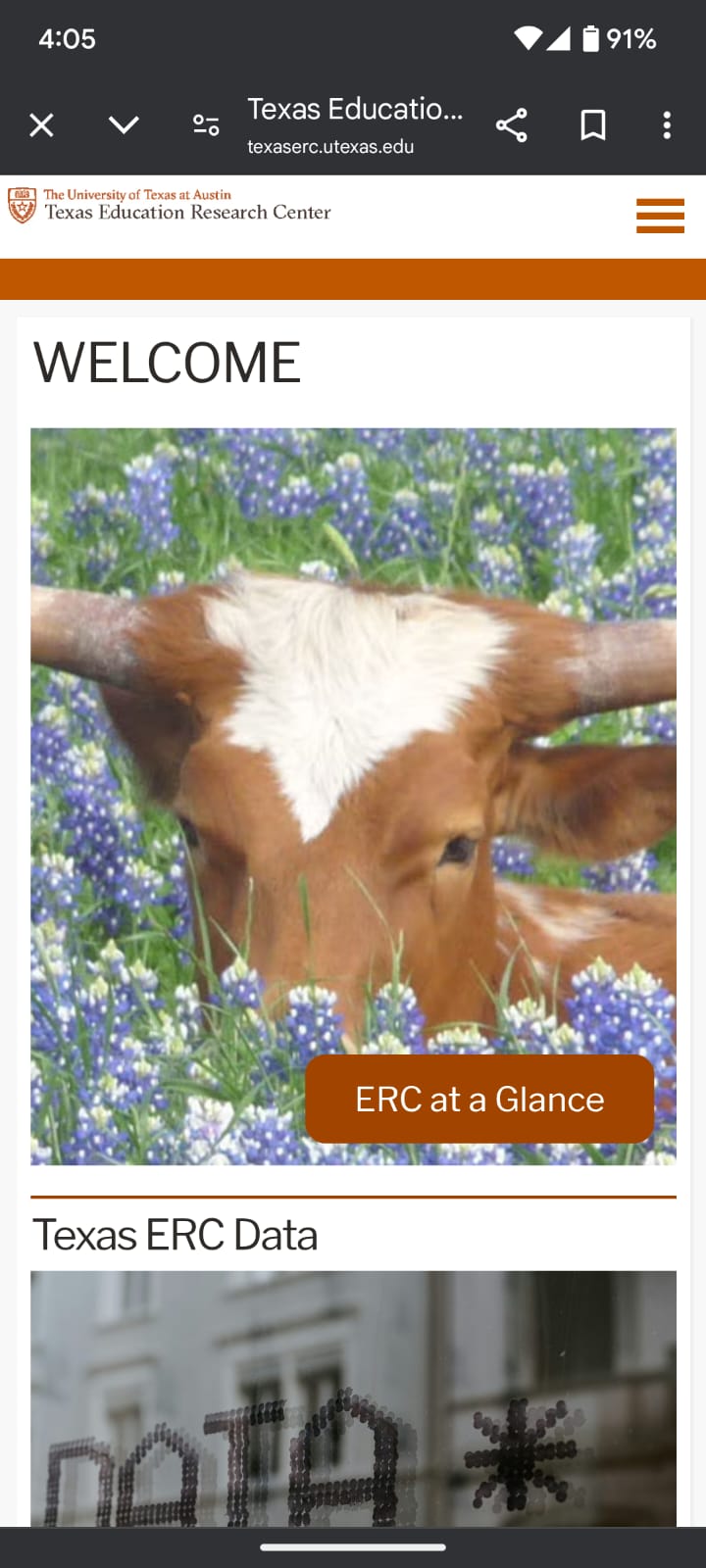
Making the Website Responsive
My major challenge in developing the website was ensuring responsiveness. I had to write custom CSS to achieve this. I regularly met with the developer and IT Manager to discuss requirements.
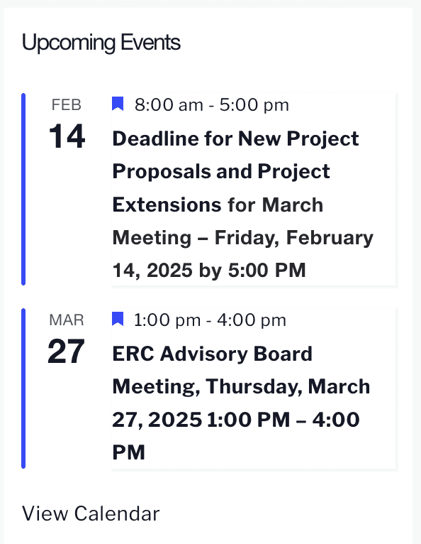
Creating Custom Widgets in WordPress
I created several widgets for the website.

Reflection & Takeaways
My research, including user surveys, interviews, and SWOT analysis, reinforced the importance of focusing on user pain points throughout the design process. Incorporating user feedback early on and during testing helped ensure that the final design aligned with user needs, making the project more impactful.
The iterative process of creating paper wireframes, low-fidelity prototypes, and high-fidelity prototypes was key to refining the design. The constant feedback loop during each phase helped me identify potential issues early and improve the overall user experience.
The development phase introduced me to new tools like WordPress, Pantheon, also deepened my experience of CSS3/HTML5. This hands-on experience not only expanded my skill set but also deepened my understanding of how design translates into functional websites. It was both challenging and rewarding to build the website, although there were some time limitations.

